From Chaos to Clarity: The Story Behind Redesigning Designing Alley Website
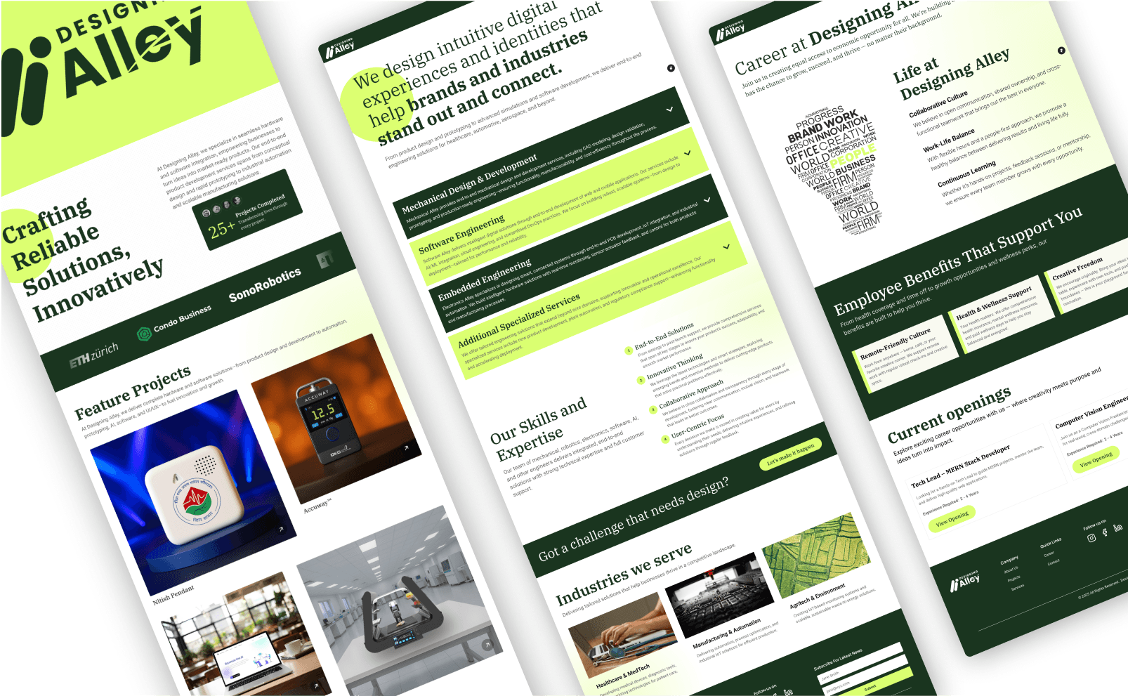
When we first created the Designing Alley website in 2024, it was mainly to have something where people can go and check out who we are and what we do. It was more like—we need something, and we need it now. No branding workshop. No color theory. Just a handful of ideas, a rushed layout, and a deep desire to build something real. And it looked something like this:
But over time, that initial version started to feel... off. It didn’t fully represent our spirit—the way we play with ideas, how we experiment, how we bring things to life.
So we paused.
Took a step back. And decided it was time for a real makeover. And this blog is our behind-the-scenes journey of that transformation.
Let’s get started.
Step 1: What Do We Even Want to Feel Like?
We started by asking the simplest (and hardest) question: What do we want people to feel when they land on our website?
Not what should they read. Not what buttons they should click. But what should they feel? what first impression do we want to make?
In our brainstorming session, words like curious, open, energized, and inspired came up again and again. We wanted people to feel like they were welcome in our space—like we’re the kind of team you could bounce wild ideas off of, we are the team that can make their ideas come to life together. So everything from color to layout had to feed into that feeling.
Step 2: Color. Chaos. Choices.
Naturally, we began with color. And chaos. And a lot of back-and-forth. We dabbled in navy and orange. Looked cool, but felt too polished.
Then we tried a calm, corporate blue. It gave a sense of safety, but didn’t feel creative or inspiring. Not the feel we wanted. Earth tones? Too grounded. We needed more lift. More spark.

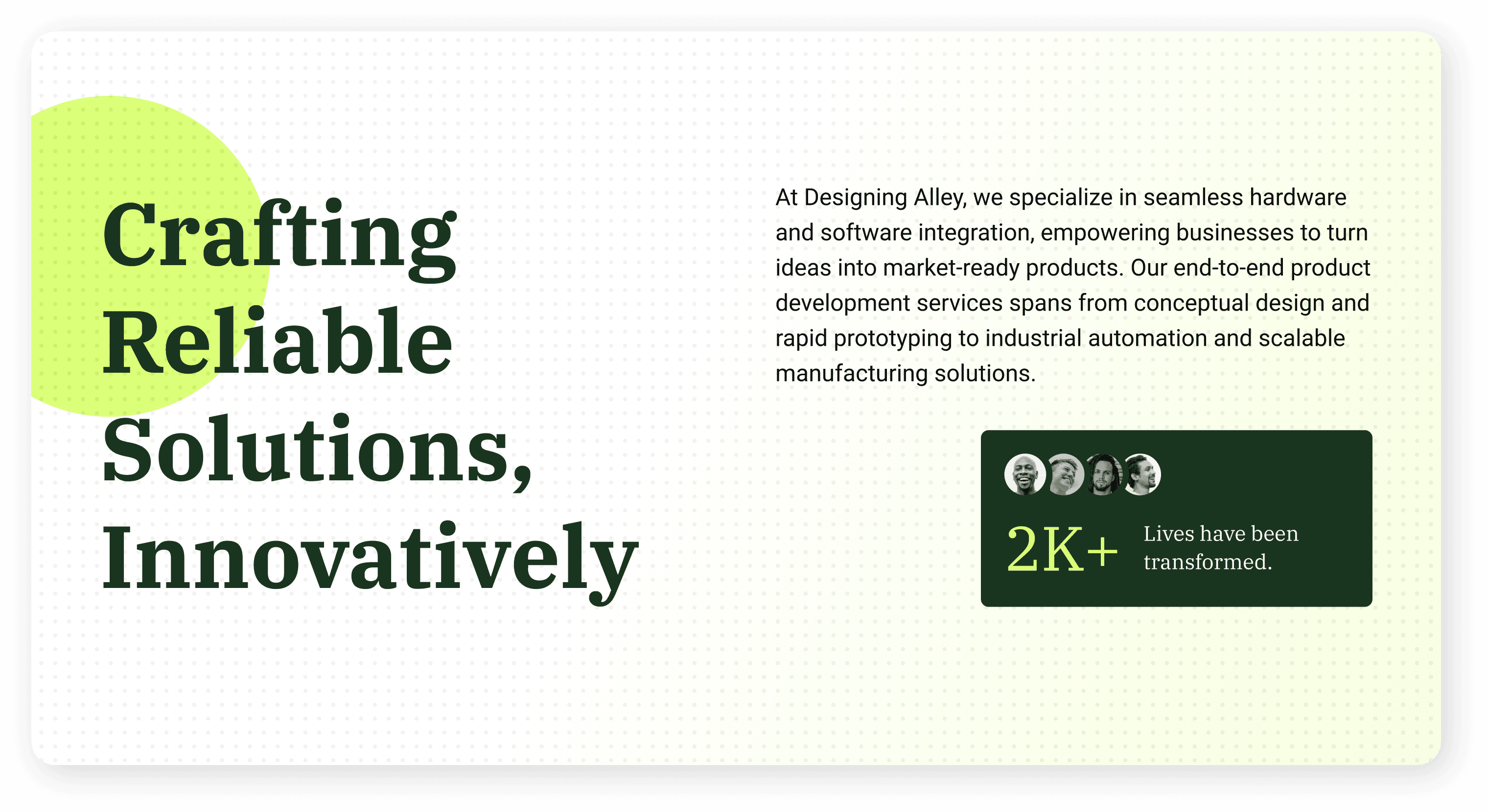
Eventually, we wandered into neon territory—not because it was trendy, but because it gave us that jolt. It felt a bit rebellious, a bit loud, and very much us. But neon alone would’ve been too intense. So we paired it with a dark olive green for balance and depth. We wanted rebellious but we also wanted our audience to feel ‘trust’ that they can build something awesome with this team. So deep olive green just did that, grounded the fun in something solid.
Step 3: Fonts That Speak
With the colors sorted (for now), we moved to fonts. Because fonts are more than decoration—they’re tone, mood, and voice.
Selecting the font is really important, but its harder than we thought. Since there are so many fonts out there, it becomes hard to select. We wanted our headlines to feel bold but not shouty. Sharp but not harsh. Also, we wanted font to feel a little familier and easy to read, easy to find as well. Easy to find on other platforms because that makes the designing job a lot more easier and help us keep the uniformity across the different marketing platforms. Finally, Roboto Condensed Bold hit that sweet spot. For the body, we went with Poppins. Friendly, legible, and just... easy. The kind of font that invites you to keep reading without trying too hard.

Step 4: Structure, Flow, and Rewrites
As the visuals began to settle, we zoomed out to look at structure.
What pages did we actually need? How much should we say on each? What kind of story do we want the homepage to tell?
We mapped it out: Home, About, Services, Case Studies, Blog, Contact.
We went through tons of reference websites, internal discussions about what we want show on these pages, how can we show that without making audience feel overwhelmed. After days we came up with initial flow (which went down the road as we started designing more….).

There were 2 pages where we wanted to give extra attention: Homepage and Portfolio (case study page)
Case studies were a huge part of the process. We knew that showcasing our past work would be key—but we didn’t always have all the photos or testimonials in place. So we had to go back, reconnect with old clients, dig through archives, and sometimes even redesign past projects just to tell their stories better.
Until the team was collecting that, we started from the Homepage.
Homepage needed extra love. It had to be an elevator pitch and a first impression and a mini-portfolio all in one.
We debated for days about the top section. Should it be a strong image? A video? A product shot? In the end, a short video felt most true to us—something quick, fun, and full of motion. But even that wasn’t easy. We didn’t have many footage or even basic images of team, the products, the office space. It felt like impossible. So we leaned into the scrappy vibe, took help of ai, bold typography, and made it work.
Video link: designingalley.com
Step 5: Texture and Visual Rhythm
Once the home was set, we focused on texture. Not literal texture, but visual rhythm.
We didn’t want a flat layout or a wall of blocks. So we introduced layered dot grids, subtle patterns, and playful spacing. It gave the site breathability. And for contrast, instead of black, we used olive green—dark enough to anchor, soft enough to not overpower. That green also made sure our neon pops didn’t fight with white backgrounds.
It wasn’t all smooth. Some of our neon combinations were unreadable. Some sections felt disconnected. But iteration by iteration, it started to click.
Step 6: Real Content, Real Stories
This part took time. Gathering real images, old prototypes, and meaningful testimonials—especially from past projects—wasn’t something we could rush. Some files were missing. Some visuals were outdated. But we knew that real stories matter more than perfect mockups.
So we rolled up our sleeves, reconnected with old clients, dug through archives, and slowly started piecing it all back together. What emerged wasn’t just content—it was our journey, our growth, and the work that shaped who we are.
And now… here we are. After three months of iteration, late-night design debates, remote team calls, and way too many “one last tweak” moments—our new website is finally live.
It’s bold. It’s clean. It feels like us.
But more than anything, it’s built with care, with intention—and with all the beautiful mess that comes with real creativity. We’ll keep evolving it. Because design has no finish line—there’s always something new to try, something unexpected to explore.
From chaos to clarity, this is the version of Designing Alley we’ve been dreaming of. And now, it’s yours to explore.
If you are thinking about redesigning your own platform or building something from scratch?
We know how messy, exciting, and meaningful that journey can be—and we’d love to be your partner in it.
Let’s build something bold, together.